Airborne & Multispectral Imaging
Aerial photo terminology and how multispectral images are displayed — true vs. false color composites.
Vertical aerial photography
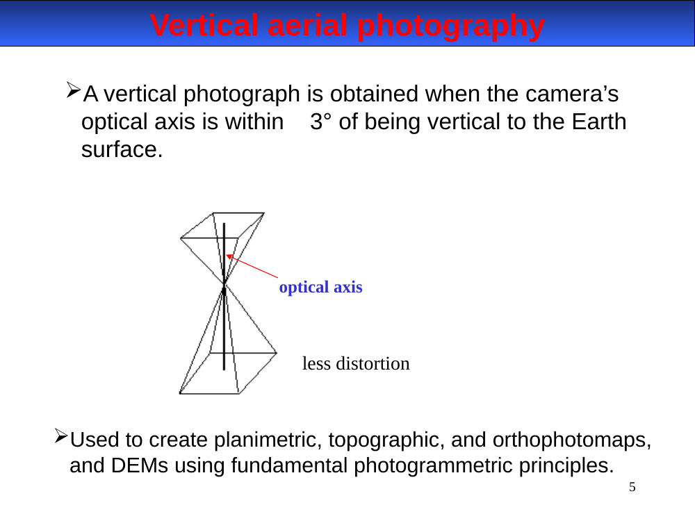
Obtained when the camera's optical axis is within 3° of vertical to the Earth's surface. Less distortion than oblique. Used to create planimetric, topographic, and orthophotomaps, and DEMs via photogrammetric principles.
In-image text (for later study-guide use)
Diagram: aircraft high above ground, optical axis pointing straight down. Label: less distortion.
Vertical aerial photography. The camera’s optical axis is within 3° of vertical.
- Less geometric distortion than oblique — nearly uniform scale across the photo.
- Uses: planimetric maps, topographic maps, orthophotomaps, and DEMs (digital elevation models) — all derived via photogrammetry (stereo overlap + parallax).
Orthophotomap example
In-image text (for later study-guide use)
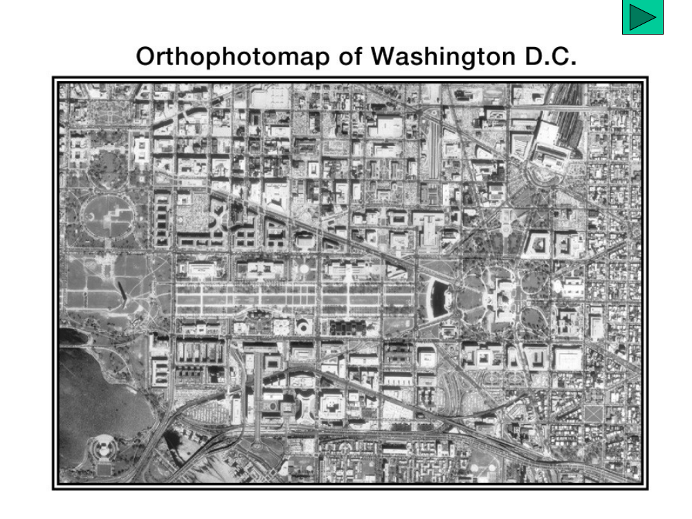
Title: Orthophotomap of Washington D.C. Grayscale vertical aerial view of downtown — the National Mall, street grid, rivers. Scale uniform across the image because relief has been corrected.
Orthophotomap example. An orthophotomap is a vertical aerial photo that has been geometrically corrected — scale is uniform everywhere, so it can be measured like a map.
- Produced from vertical photography (slide 5) plus a DEM to remove relief displacement.
- Example shown: Washington D.C. downtown.
Oblique aerial photography
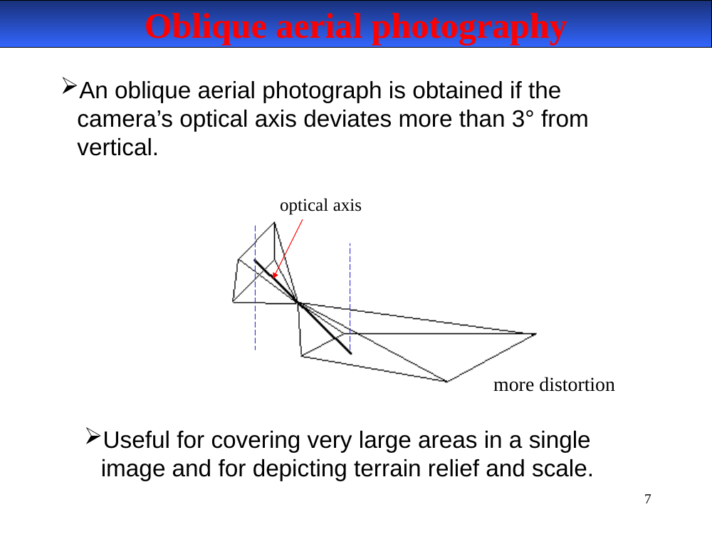
Obtained when the camera's optical axis deviates more than 3° from vertical. Produces more distortion but covers larger areas in a single frame and emphasizes terrain relief.
In-image text (for later study-guide use)
Diagram: aircraft with optical axis tilted, viewing ground at an angle. Label: more distortion.
Oblique aerial photography. The camera’s optical axis deviates more than 3° from vertical.
- More geometric distortion — scale varies from foreground (large) to background (small).
- Strengths: covers a very large area in a single image; depicts terrain relief and scale in a way vertical photos can’t.
- Used for reconnaissance, scenic/interpretive imagery, and rapid situational assessment.
Topographic map example
In-image text (for later study-guide use)
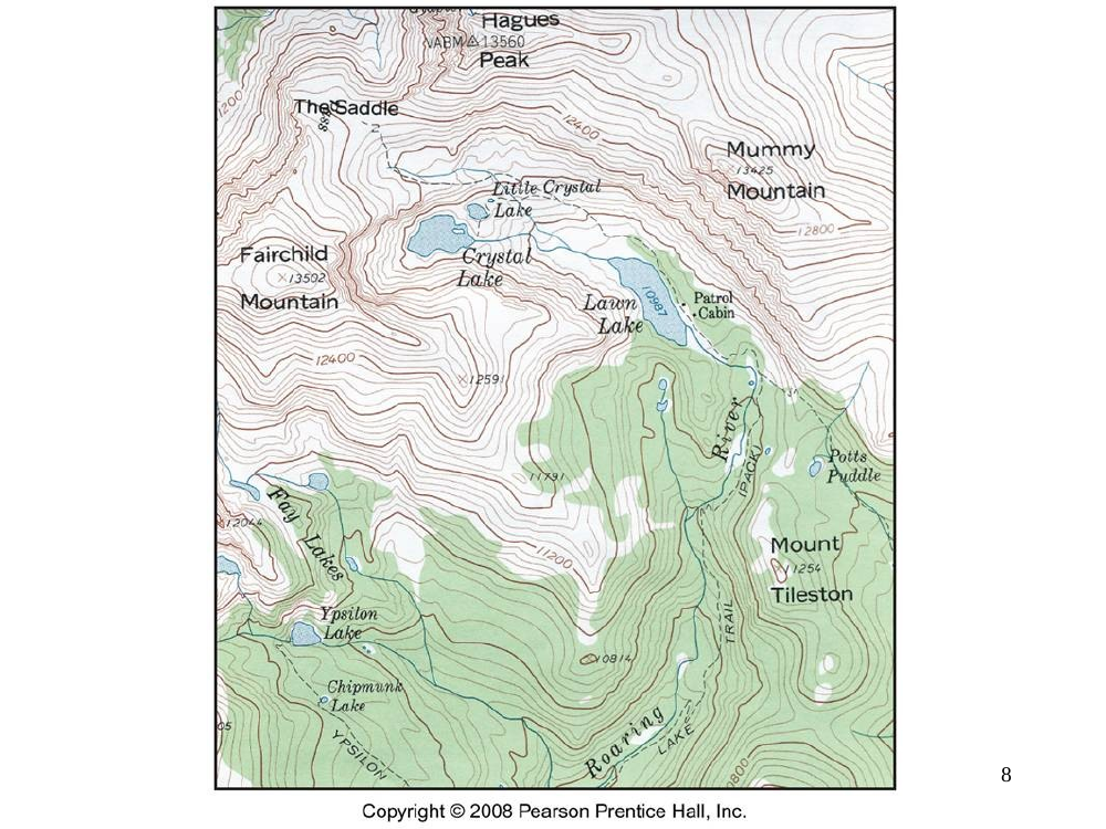
A portion of a topographic map with peaks, lakes, and drainages labeled (e.g., The Saddle, Hagues Peak, Mummy Mountain, Mount Tileston). Credit: Pearson Prentice Hall.
Topographic map example. A topographic map represents terrain using contour lines (elevation), symbols, and color. Not itself an aerial photograph — but topographic maps are frequently compiled from vertical aerial photography using photogrammetric methods.
- Shows named features (peaks, lakes, drainages) with elevation context.
- Copyright Pearson Prentice Hall / similar reference maps.
Oblique panorama — the same terrain
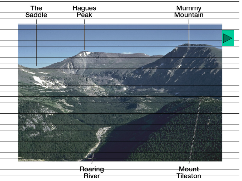
In-image text (for later study-guide use)
A ground-level panoramic photograph showing the same peaks as the topographic map on slide 8 — labeled The Saddle, Hagues Peak, Mummy Mountain, Mount Tileston, with the Roaring River valley in the foreground.
Comparing the topographic map (slide 8) with this panorama shows how relief is encoded in contour lines vs. seen directly in an oblique photo.
Oblique ground-level panorama. Illustrates how an oblique view captures terrain relief and perspective — peaks, ridges, valleys — in one frame, in ways a vertical nadir photo can’t.
- Labels visible: The Saddle, Hagues Peak, Mummy Mountain, Roaring River, Mount Tileston.
Flight height (altitude)
Altitude of the camera above ground level (AGL), for a given focal length:
- the higher the altitude, the larger the area covered (smaller scale)
- the lower the altitude, the smaller the area covered (larger scale)
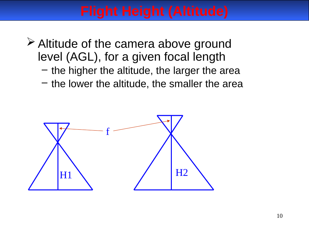
In-image text (for later study-guide use)
Two cones showing the same focal length f at altitudes H₁ (low, narrow footprint) and H₂ (high, wide footprint).
Flight height (altitude above ground level, AGL). For a given focal length (f):
- Higher altitude (H₂) → larger area covered, smaller scale per photo.
-
Lower altitude (H₁) → smaller area, larger scale — finer detail.
- Trade-off: more area per shot means fewer shots to cover a region, but coarser detail.
View angle
The field of view of a camera. Given the same flight height, view angle is determined by focal length:
- Smaller focal length → larger view angle (wide-angle).
- Larger focal length → smaller view angle (telephoto).
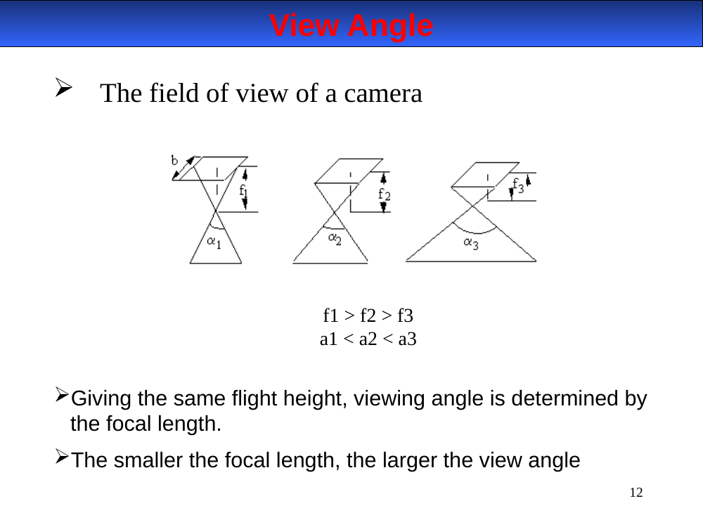
In-image text (for later study-guide use)
Three camera cones showing focal lengths f₁ > f₂ > f₃ and corresponding view angles α₁ < α₂ < α₃. Baseline b represents the image (film) plane.
View angle = field of view (FOV) of the camera.
- Given the same flight height, view angle is determined by focal length.
- Smaller focal length → larger view angle (wide-angle lens).
-
Larger focal length → smaller view angle (telephoto).
- Diagram relationships:
f₁ > f₂ > f₃⟺α₁ < α₂ < α₃.
Ground coverage
The actual area on the ground that one aerial photograph covers — determined by altitude and camera viewing angle.
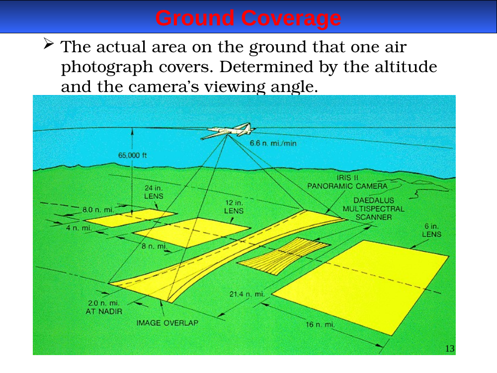
In-image text (for later study-guide use)
3D diagram with aircraft overhead, showing overlapping photo footprints on the terrain. Annotations indicate image overlap and sidelap between adjacent frames and flight lines.
Ground coverage. The actual area on the ground that one aerial photograph covers.
- Determined by altitude (H) and camera viewing angle (α).
- Larger H or larger α → larger ground coverage.
- Larger coverage per frame means fewer photos needed to cover a region — but each photo sees finer detail at the center and coarser/distorted detail at the edges.
Multispectral imaging
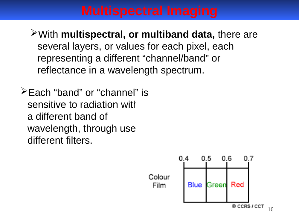
With multispectral (multiband) data, each pixel carries several values — one per channel/band. Each band is sensitive to a different wavelength range, achieved via different filters over the detectors.
In-image text (for later study-guide use)
Diagram labeled Colour Film showing the three visible bands split at 0.4, 0.5, 0.6, 0.7 µm — Blue (0.4–0.5), Green (0.5–0.6), Red (0.6–0.7). Credit: CCRS/CCT.
Multispectral imaging. Several layers per pixel — one channel for each wavelength band.
- Each channel samples a different wavelength range, achieved with different filters over the detectors.
- Stored as a stack: each pixel is a vector of values (one per band).
- Enables band math (ratios, indices like NDVI) and classification.
- Example color film split: 0.4–0.5 µm blue, 0.5–0.6 µm green, 0.6–0.7 µm red.
Color types — additive vs. subtractive
- Additive primaries: Red, Green, Blue.
- Subtractive primaries: Cyan, Magenta, Yellow.
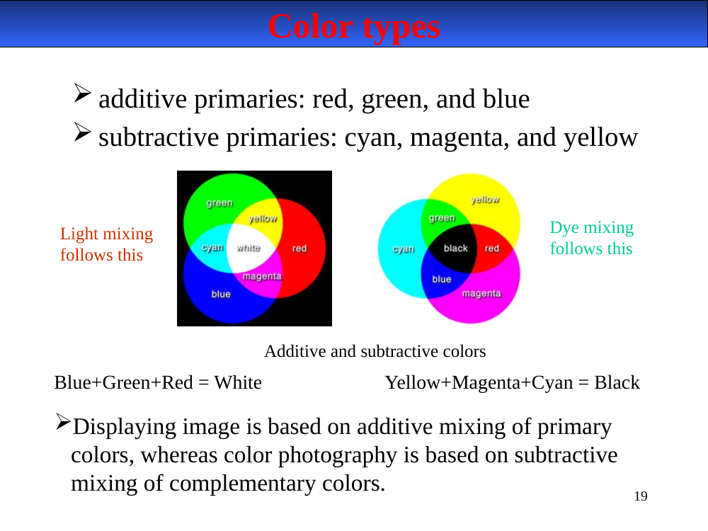
Displaying a digital image uses additive mixing; color photography uses subtractive mixing of complementary colors.
In-image text (for later study-guide use)
Two overlapping-circle diagrams:
- Light mixing (additive, RGB): Red + Green + Blue = White; overlapping pairs = Yellow, Cyan, Magenta.
- Dye mixing (subtractive, CMY): Cyan + Magenta + Yellow = Black; overlapping pairs = Red, Green, Blue.
Color theory — two mixing models.
- Additive primaries: Red, Green, Blue (RGB). Used by light-emitting displays — monitors, projectors, sensors. R + G + B = White.
-
Subtractive primaries: Cyan, Magenta, Yellow (CMY). Used by inks and dyes — printing, color photography. C + M + Y = Black (in theory).
- Displaying a digital image uses additive mixing (RGB).
- Color photography (film prints) uses subtractive mixing of complementary dyes.
True color composite
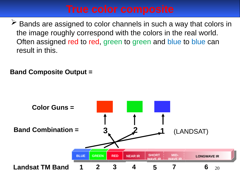
Bands are assigned to color channels so the image roughly matches real-world colors — red to red, green to green, blue to blue.
In-image text (for later study-guide use)
Diagram: Band Combination 3-2-1 (Landsat TM) sent to the red, green, and blue color guns respectively.
Landsat TM band strip across bottom: 1 = Blue, 2 = Green, 3 = Red, 4 = Near IR, 5 = SWIR, 7 = Mid IR, 6 = Longwave IR (thermal).
True-color composite. Bands are assigned to the R / G / B display guns in the same order as the real-world colors — red → red gun, green → green gun, blue → blue gun — so the image looks roughly like what your eye would see.
- Landsat TM band mapping for true color: R = Band 3 (Red), G = Band 2 (Green), B = Band 1 (Blue).
- Landsat TM band numbering cheat sheet: 1-Blue, 2-Green, 3-Red, 4-NIR, 5-SWIR, 7-MIR, 6-Thermal (note 7 lies spectrally between 5 and 6 but is numbered out of order historically).
- On Landsat 8/9 (OLI): the same true-color recipe is R = B4, G = B3, B = B2 (band numbers shifted by one because OLI added Band 1 coastal/aerosol).
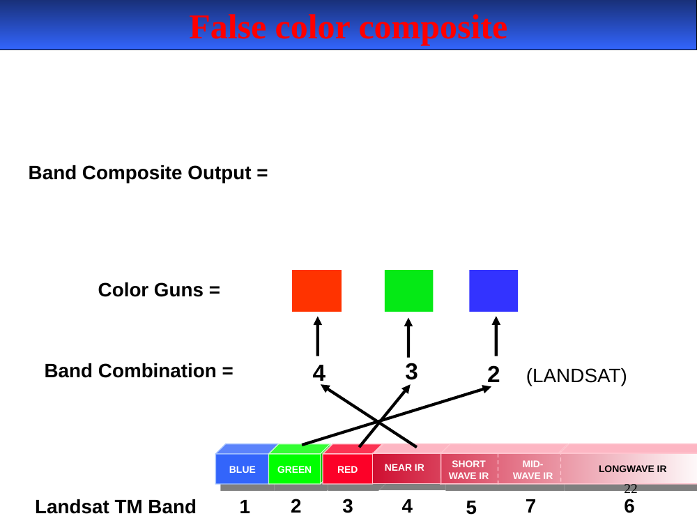
False color composite
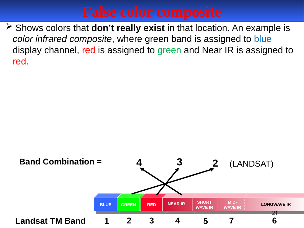
Colors don't correspond to real-world colors. The classic color-infrared composite assigns Green → Blue channel, Red → Green channel, Near-IR → Red channel, so vegetation appears red.
In-image text (for later study-guide use)
Diagram: Band Combination 4-3-2 (Landsat TM) sent to the red, green, and blue color guns respectively.
Landsat TM band strip across bottom (same as slide 20): 1 = Blue, 2 = Green, 3 = Red, 4 = NIR, 5 = SWIR, 7 = Mid IR, 6 = Longwave IR.
False-color composite (color-infrared). Shows colors that don’t correspond to real-world colors — specifically, assigns the near-IR band to the red display gun so that healthy vegetation (high NIR) glows bright red.
- Classic CIR recipe on Landsat TM: R = Band 4 (NIR), G = Band 3 (Red), B = Band 2 (Green).
- Makes vegetation, water, urban fabric much easier to discriminate than in true color.
- Uses: crop stress, burn scars, wetland delineation, timber mapping.
- On Landsat 8/9 (OLI): the equivalent CIR is R = B5, G = B4, B = B3.
False color composite — schematic
In-image text (for later study-guide use)
Cleaner repeat of slide 21: Band Combination 4-3-2 (LANDSAT) arrowed to the red / green / blue color guns. Landsat TM band strip: 1-Blue, 2-Green, 3-Red, 4-NIR, 5-SWIR, 7-Mid IR, 6-Longwave IR.
False color composite — schematic repeated. The display gun mapping again: 4 → Red gun, 3 → Green gun, 2 → Blue gun.
- Mnemonic: “NIR goes red, red goes green, green goes blue.” (Each band shifts one slot toward the longer-wavelength display primary.)
- Useful check when you open imagery: if vegetation is bright red, you’re looking at a false-color (CIR) composite.
Deck: 2024Lillesand_MaRemoteSense3-airborne (1).pptx — 22 slides.
Download original
·
Edit our reproduction